Integrate Files, Data & Systems
Read from and write to any accessible data store.

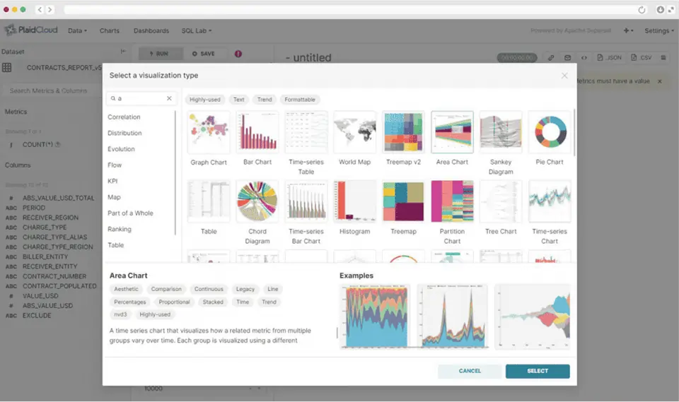
The PlaidCloud Data Visualization solution provides data connectors for system and data source integration, an extensive collection of analysis and enrichment tools, and the ability to easily create Apache Superset charts.






No Separate BI Tool Required
PlaidCloud combines a massively parallel data pipeline with a fully integrated Apache Superset environment in a single platform. Finance and operations teams don't need a separate BI tool, a dedicated data engineering team, or a complex ETL process to get to a live dashboard. The drag-and-drop dashboard builder lets analysts move from raw ERP data to a published chart in a single workflow. Connecting, transforming, and visualizing in one place.
Greenplum + Apache Superset, Together
PlaidCloud is the only platform that brings together the power of Greenplum and Apache Superset into a cohesive data analysis and data visualization experience. Interactive dashboards over billions of rows without the lag.
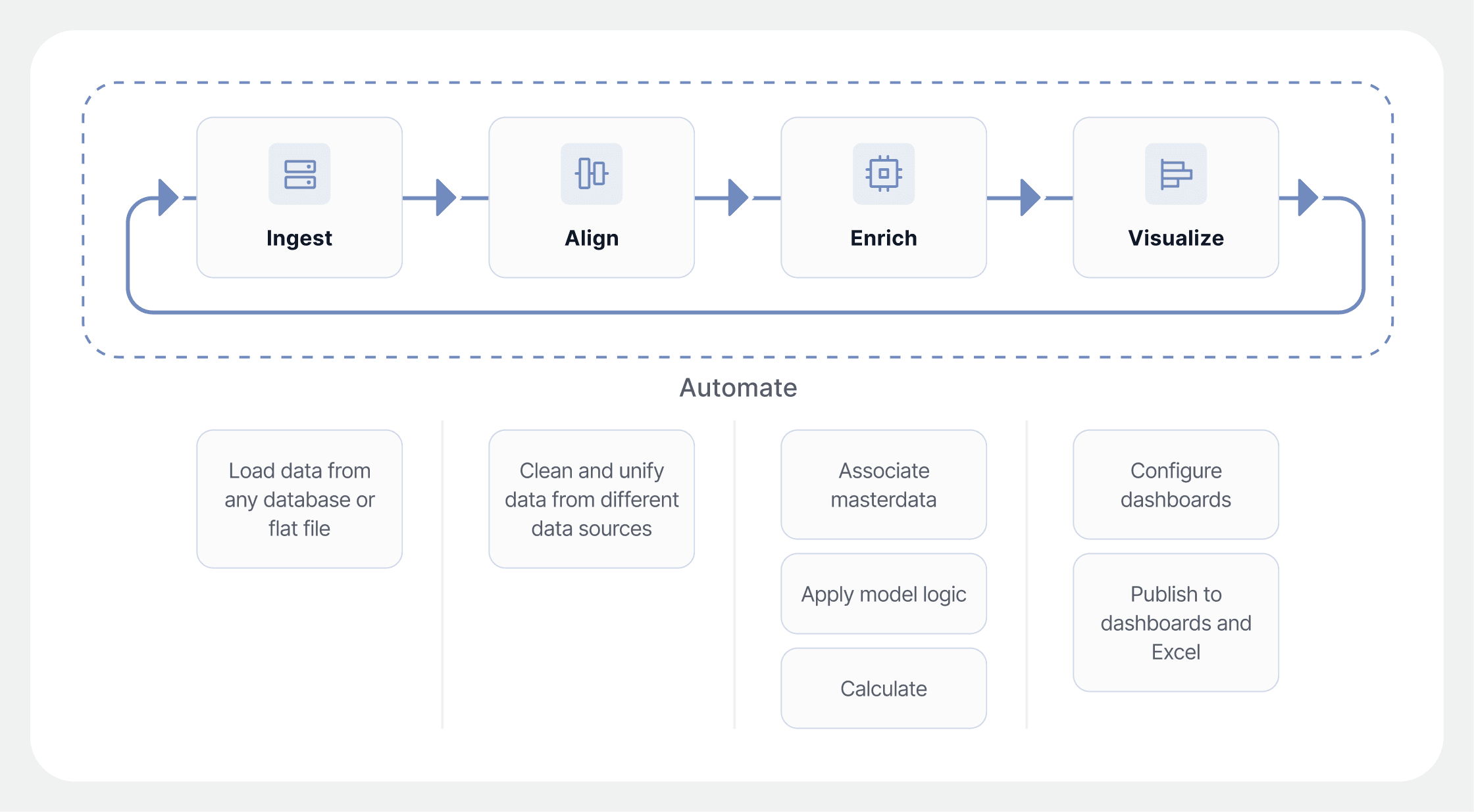
Integrate, Align, Enrich. Then Visualize
Build and deploy data pipelines that integrate, align, and enrich information using massively-parallel data pipeline technology. Then publish the results straight to a dashboard, all in one workflow.
Read from and write to any accessible data store.
PlaidCloud uses Greenplum technology to handle large data efficiently.
Extensive library of extraction, transformation, and visualization tools with point-and-click configuration.
Big Number, Bar, Sankey, Pie & Map Charts
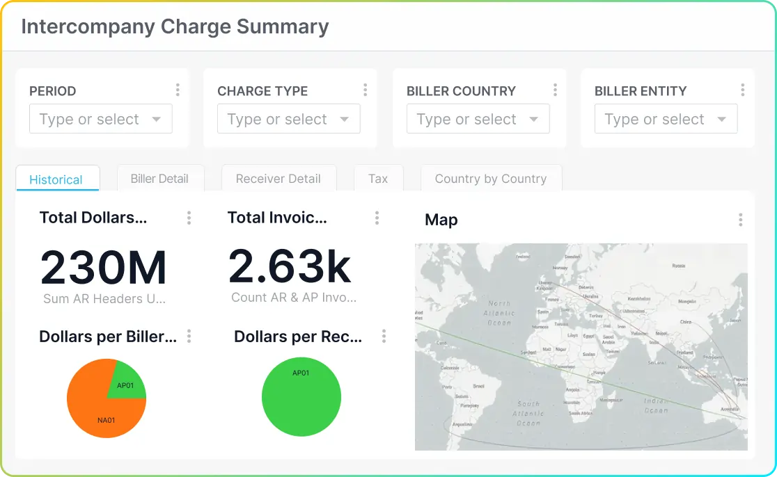
Big Number, Bar, and Sankey charts of multi-level cost allocations. Big number, pie, and map charts of intercompany invoices. The full Superset chart library at your disposal.
Mixed Bar & Line, Nested Treemap
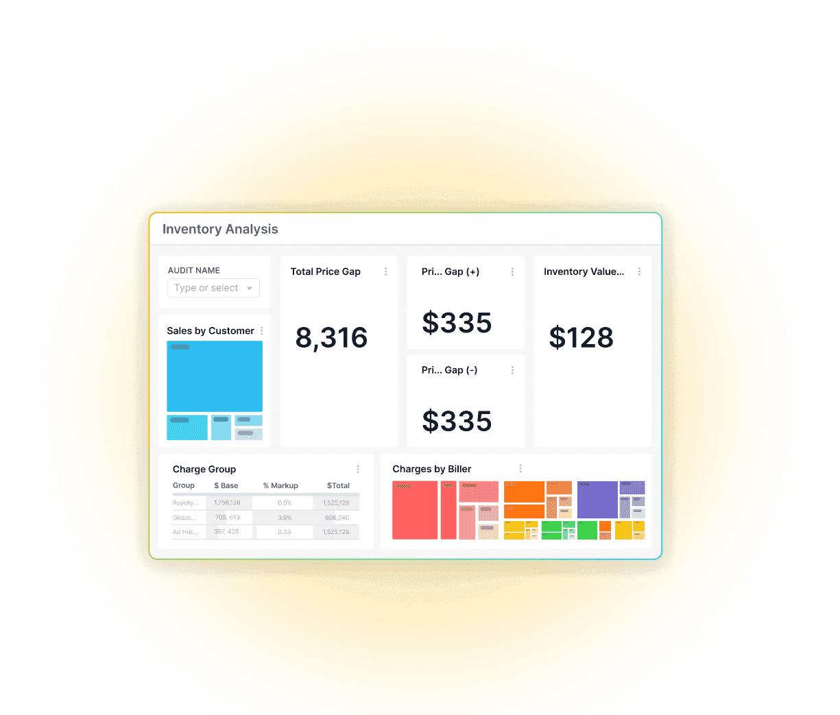
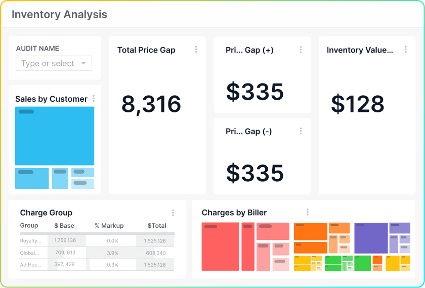
Mixed bar and line chart of inventory forecast. Nested treemap of inventory analysis. Operational dashboards that update automatically when workflows complete.
30 minutes. Your data. A walkthrough of PlaidCloud's built-in Apache Superset dashboards.
PlaidCloud's visualization layer is built on Apache Superset, a leading open-source dashboard platform, and it is included with the platform, so there is no separate BI tool to license.
Yes. Dashboards query PlaidCloud's high-performance engine directly, so they stay responsive on large, transaction-grain datasets instead of relying on downsampled extracts.
Yes. Visualizations read the same governed tables your workflows and allocation models produce, so numbers in dashboards always match the model, with no export step in between.
Yes. Access follows PlaidCloud's roles and permissions, so you can share dashboards broadly while restricting sensitive views to the right people.
Insights

We use cookies to analyze site traffic and improve your experience. See ourCookie Policy.